
A journey in, through and around design via life in the GSU Graphic Design BFA Program...
Thursday, October 25, 2012
Wednesday, October 24, 2012
First Drafts of Yellow Bird Shiraz Re-Design
The first is hand-lettered. I like the lettering, but not necessarily with the design. The second is the one I am leaning toward further refining. :-)


Gestalt Principles in Design
This is an *amazing* read on the Gestalt principles employed by many who work in the Swiss/International Style (like Armin Hofmann for my GRD History peeps)...
Gestalt Principles Applied in Design
Gestalt Principles Applied in Design
Who Says Airplane Livery Can't Be Cool?
This is good design (and good humor), both of which I adore. :-)


Friday, October 19, 2012


Thursday, October 18, 2012

Sunday, October 14, 2012
Print Inspiration In An Unlikely Place...
In this particular instance, I had gotten a literal inspiration from a trip up north to be in a friend's wedding. Stan had just assigned the Illustrative Type project, and I thought I knew exactly what I was doing. That is, until I stumbled upon my idea for GEOP in Delta's Sky Magazine. The concentric circles and shapes gave me the idea to create my optical-illusion-esque typeface. The rest is history. :-)

Each Week I Feel As Though I Must Check In With... BrainPickings
This is one of my "check-in" websites... it always has really cool graphic (and other) inspirations. Here is what I recently found. It is a post of minimalist children's book posters. :-)
www.brainpickings.org/
www.brainpickings.org/
Saturday, October 13, 2012
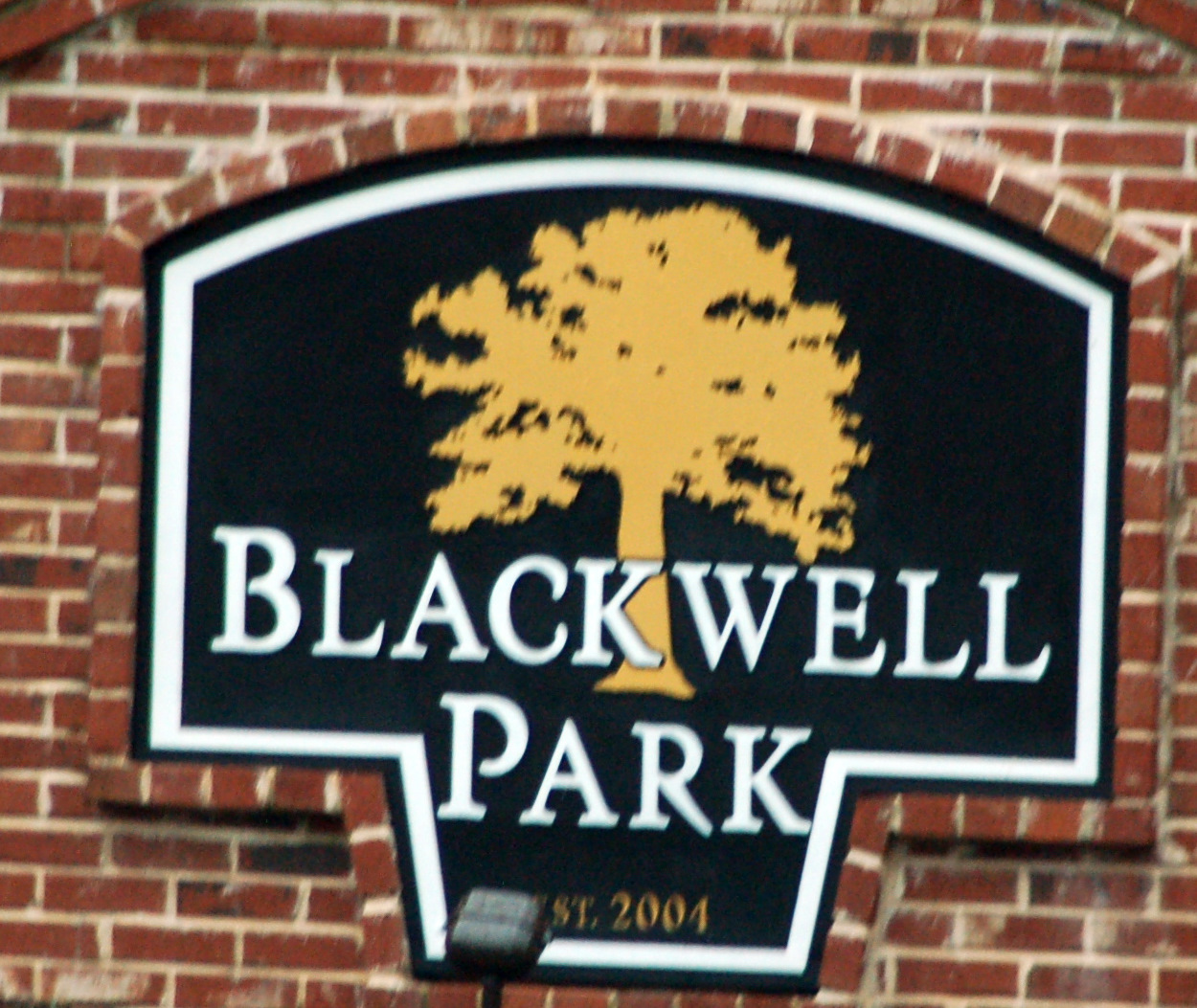
Block Of Type
So, I am a relatively boring suburb-dweller. As a result, I have less-than-artist examples of type in / near my neighborhood. I decided to focus primarily on subdivision signs. I saw an art exhibit in the West Atlanta art district about year ago that showed two LED screens next to each other that generated subdivision names. The first screen had the proper name or adjective, the second had a topographic feature or grandiose synonym for a house. It has stuck with me how ridiculous this whole suburban facade thing is (from McMansions to pretentious neighborhood names). Here is the proof:


Thursday, October 11, 2012
Workspace (!?!)
My workspace...
Well, let's just say that, like 50% of relationships on Facebook, it's complicated.
The backstory: Our archaic water heater succumbed to metal fatigue and exploded all over our downstairs. Water, water everywhere.
So, like any good story, it's kind of a good news/bad news thing...
The good news is, it was covered by insurance. The nice folks at ServiceMaster came and packed up all of our stuff and hauled it away, set up industrial dehumidifiers and tore out all of the carpet. After what seemed like a ridiculously long period of time (in reality, six weeks) our carpet finally arrived at Home Depot and the contractors came to install it on Monday.
The bad news? I have gone over a month with none of my design supplies, except what I foresaw that I would need and grabbed before pack-up. And, I should mention that my husband, who works from home, had no office either. Needless to say, the dining room table has been a bevy of activity, and accurately reflects the current state of chaos...
Today? ServiceMaster unloaded a pallet of boxes. Today, my workspace is softly carpeted, well-lit and still packed in cardboard and I have a bunch of water-logged furniture in the driveway that I have to figure out what to do with... ;-)
Wednesday, October 10, 2012
This Is Not An Appropriate Way To Show A Love Of Typography

Subscribe to:
Posts (Atom)